This is my Creative Critical Reflect on my movie project. I chose to do a make-up video like the VOGUE beauty secrets that I always love to watch. Hope you enjoy!
For this exciting media project i chose some great people. My group members are Violet Roberts, Mila Rakic, and Addison Walker. In AS level, I have already worked with violet and mila so i decided to work with them again because i liked their work ethic. Violet is a great cameraman/director. Last year she was always the camera man and did a greta job at holding the phone still. She understood how to hold the camera or where to place the actors so that it would look professional and clean. She would always do her part in the project and was a great person if we ever needed someone to step in. I worked with Mila for the commercial last year. She did a really good job at editing, researching, and just doing her part. She is very nice and wont mind if she had to do a little extra work or get her hands dirty. I have never worked with addison but i have known her for a while. I watched her project from last year and thought she did a really great job at acting and editing. I know...
Pitch 1: A girl keeps making new friends, little do they know she holds a big secret. Pitch 2: A man moves to a small town, and starts a new job at the local police station. Pitch 1 is a practical choice for our group. We have access to the said friends that would be needed to film. Also there is more wiggle room for the first pitch because the secret isn't revealed yet. There are many pros to this pitch but there are a few cons. The pitch can appear to be generic at first glance. We would not want to have a movie that follows a very basic storyline. But we can trust with our group that this movie would not follow the typical movie conventions. Pitch 2 is also a reasonable choice for our group. One of our group members lives in a small town, so the setting is ideal. However, there are some cons in this pitch, including the fact that the character is a police officer, and there is a chance we could misrepresent the police force. We would not want to offend anyone with ...
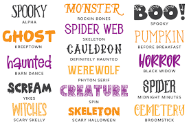
The movie title we have picked is "Unfriended" The title will be in a bold, spooky looking font and will appear on the screen for 3-4 seconds and it will fade out. This title will take up most of the width on the screen, to ensure that the audience will see it. The color we chose was black because it stands out the most. The other titles will be in a different font from the film title, to make the film title stand out more. The other titles will be a normal everyday like font. They will also be black and will appear on screen for 2-3 seconds depending on the title. Every title, not including the film title, will appear in the bottom right corner of the screen. It will only take up a small portion of the screen, so that it won't distract the audience from the scene, but it will also be big enough to be read. The titles will fade out after their 2-3 seconds on screen. The name of the studio is "Berry Studios" and the production company is going to be "Four Gi...


Comments
Post a Comment